For years, businesses were told that having a mobile-friendly website was essential for ranking well on Google. While that remains true today, the reality is that mobile SEO has evolved far beyond responsive design and page speed.
With the rise of AI-powered search experiences, voice assistants, and conversational search, businesses must now optimise not only for search engines but also for the AI systems that increasingly help users find information online.
If your website is difficult to navigate on mobile devices, slow to load, or poorly structured, you risk losing visibility in both traditional search results and AI-generated answers.
In this guide, we’ll explore what mobile SEO means today and how businesses can improve their online visibility in the age of AI.
Note: This blog post was completely updated from an article first published on 5 Oct 2021.

What is Mobile SEO?
Mobile SEO is the process of optimising a website so that users can easily access, navigate, and interact with its content on smartphones and tablets.
Traditionally, mobile SEO focused on factors such as:
- Responsive website design
- Mobile page speed
- Mobile usability
- Readability on smaller screens
- Touch-friendly navigation
While these elements remain important, modern mobile SEO also involves ensuring that search engines and AI systems can easily understand, interpret, and recommend your content.
In other words, mobile SEO is no longer just about rankings. It is increasingly about discoverability.
Why Mobile SEO Still Matters
Mobile devices continue to dominate internet usage worldwide.
According to StatCounter data analysed by Statista, mobile devices accounted for approximately 58.5% of global website traffic during 2025. For many businesses, the majority of website visitors now arrive via smartphones rather than desktop computers.
This trend is particularly significant in Southeast Asia, where mobile internet adoption is among the highest in the world and consumers increasingly rely on their phones to research products, compare services, and make purchasing decisions.
At the same time, search engines continue to prioritise mobile experiences.
Google’s mobile-first indexing means the mobile version of your website is the primary version used to evaluate content quality, relevance, and search performance. If your mobile experience is poor, your rankings may suffer regardless of how well your desktop website performs.
Search Behaviour is Changing
Mobile devices remain the primary gateway to information, but the way users search is evolving rapidly.
Instead of relying solely on traditional keyword searches, users increasingly interact with:
- Google AI Overviews
- ChatGPT
- Gemini
- Perplexity
- Voice assistants
- Conversational search interfaces
Rather than typing short phrases such as “SEO agency Singapore,” users are increasingly asking complete questions such as:
- Which SEO agency is best for a small business?
- How much does SEO cost in Singapore?
- What should I look for when hiring a marketing consultant?
This shift means businesses must optimise their websites not only for search engines but also for AI systems that summarise, recommend, and surface content directly within search experiences.
Mobile-First Indexing Remains a Foundation
Google completed its transition to mobile-first indexing several years ago, but many businesses still underestimate its importance.
Mobile-first indexing means Google primarily evaluates your website’s mobile version when determining:
- Search rankings
- Content relevance
- User experience signals
- Technical SEO performance
As a result, businesses should ensure that mobile visitors have access to the same content, functionality, and information available on desktop versions of their websites.
A website that performs well on desktop but poorly on mobile may struggle to achieve strong organic visibility.
Key Mobile SEO Factors for 2026
#1 - Responsive Website Design
Responsive design remains the foundation of mobile SEO.
A responsive website automatically adjusts its layout and content based on the user’s device, ensuring a consistent experience across smartphones, tablets, and desktops.
A well-designed mobile experience should provide:
- Easy navigation
- Readable text without zooming
- Touch-friendly buttons
- Fast access to important information
- Minimal user frustration
Businesses that neglect mobile usability often experience higher bounce rates and lower conversion rates.
How to Check if Your Website is Mobile-friendly
The easiest way to check mobile-friendliness or issues encountered during your website’s loading is through Google’s mobile page testing tool. The mobile-friendly test tool of Google can provide you with all the necessary information you require to properly maintain your website’s mobile version.

If you see the above test results of our website, Evolve & Adapt, you will understand how it displays the responsive mobile version on the right with the result on the left saying the page is mobile-friendly.
All you need to do is enter the page URL and click “Test URL”. It will not just show you if the page is mobile-friendly, it, as well, will guide you if there are any issues you need to fix. This tool serves as a green light.
Once you are done fixing the errors, you can easily continue working on the mobile SEO strategy to improve your website’s performance and online visibility.
#2 - Mobile Page Speed
Speed continues to be one of the most important aspects of mobile SEO.
Users expect websites to load quickly, and even small delays can negatively affect engagement and conversions.
According to Ericsson’s Mobility Report, global mobile data traffic continues to grow significantly each year, driven largely by video consumption and increasingly data-rich online experiences. As internet speeds improve, users become less tolerant of slow-loading websites.
To improve mobile performance:
- Compress and optimise images
- Use modern image formats
- Minimise unnecessary scripts
- Enable browser caching
- Reduce server response times
- Use a Content Delivery Network (CDN)
Faster websites generally deliver better user experiences and stronger SEO performance.
Google’s Core Web Vitals remain useful indicators of page experience.
These metrics evaluate:
- Loading performance
- Visual stability
- Responsiveness to user interaction
While content quality remains the most important ranking consideration, websites that provide poor user experiences often struggle to compete effectively.
Monitoring Core Web Vitals helps identify technical issues that may affect both search visibility and conversion rates.
You can measure Core Vitals through various tools, but Google’s PageSpeed Insights is the most popular tool of all. Enter your website’s URL and press “Analyse”.
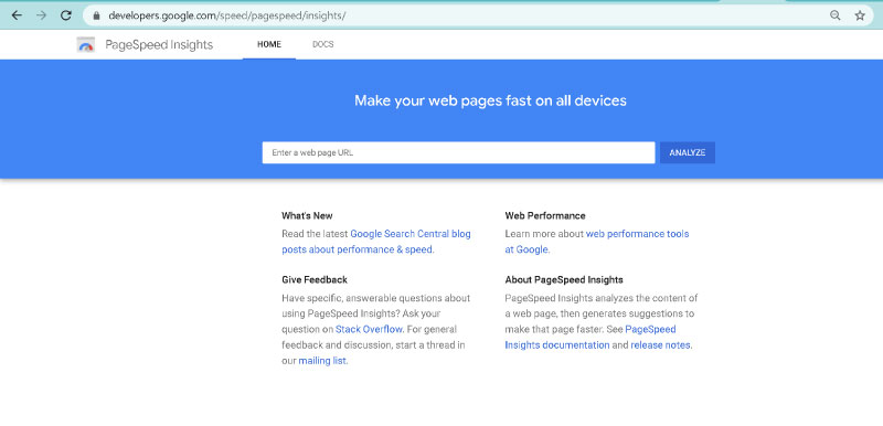
Below is our website’s data extracted from the PageSpeed Insights with all the primary Core Web Vitals metrics optimised. A point to ponder is that even though we can view both desktop and mobile data, we will stick to improving the mobile version as much as we can. This does not mean we neglect the desktop version. The desktop’s performance is as important as mobile; however, SEO ranking-wise, we will emphasise overall mobile performance.

#3 - Content Structure for AI Search
One of the most important developments in modern SEO is the growth of AI-powered search experiences.
AI systems prefer content that is:
- Well organised
- Clearly structured
- Easy to understand
- Factually accurate
- Authoritative
To improve visibility in both traditional search results and AI-generated responses:
- Use descriptive headings and subheadings
- Organise information into logical sections
- Answer common questions directly
- Include FAQ sections where relevant
- Use bullet points to improve readability
- Implement structured data where appropriate
The easier your content is to understand, the more likely it is to be surfaced by AI-powered search platforms.
#4 - Voice Search Optimisation
Voice search continues to influence how users interact with mobile devices.
Unlike traditional keyword searches, voice searches tend to be longer, more conversational, and often phrased as complete questions.
For example:
Traditional search:
“marketing consultant Singapore”
Voice search:
“Who is the best marketing consultant for SMEs in Singapore?”
Businesses should optimise content around natural language queries and customer questions.
Creating content that directly addresses common customer concerns can improve visibility across both voice search and AI-assisted search experiences.
#5 - Local SEO for Mobile Users
Many mobile searches are driven by immediate local intent.
Users frequently search for:
- Services near me
- Restaurants nearby
- Business opening hours
- Contact information
- Directions and locations
To improve local mobile visibility:
- Keep your Google Business Profile updated
- Ensure business information is consistent across directories
- Include location-specific content where relevant
- Make contact information easily accessible
- Encourage customer reviews
Strong local SEO helps businesses capture high-intent users who are ready to take action.
#6 - Building Trust and Authority
As AI systems become increasingly involved in information discovery, trust signals are becoming more important than ever.
Search engines and AI platforms are more likely to reference content that demonstrates expertise and credibility.
Businesses should focus on:
- Publishing original insights
- Showcasing industry expertise
- Developing case studies
- Earning quality backlinks
- Maintaining accurate business information
- Demonstrating real-world experience
Authority and trust are increasingly becoming competitive advantages in both traditional SEO and AI-powered search.
#7 - Mobile SEO and AI Discoverability
The future of SEO is not simply about ranking number one for a keyword.
Increasingly, success depends on whether your content can be discovered, understood, and recommended by AI systems that help users navigate information online.
This requires a combination of:
- Excellent mobile user experience
- Fast website performance
- High-quality content
- Clear content structure
- Technical SEO best practices
- Strong authority signals
Businesses that embrace these principles will be better positioned to capture traffic from both traditional search engines and emerging AI-powered search platforms.
The Bottom Line
Mobile SEO remains one of the most important aspects of digital marketing, but its role has evolved significantly.
Today, success requires more than simply having a mobile-friendly website. Businesses must create websites that are fast, accessible, trustworthy, and easy for both users and AI systems to understand.
As mobile devices continue to account for the majority of global web traffic, organisations that combine strong mobile optimisation with AI-focused content strategies will be best positioned to attract qualified visitors, generate leads, and remain competitive in an increasingly AI-driven search landscape.
Mobile SEO is no longer just about ranking. It is about ensuring your business can be discovered wherever and however people search.


